Marfeel
- Role
- Senior Product Designer · Front-end Developer
- Team
- Design lead working with product and engineering
- Impact
- Built the design system from zero with Storybook integration. Unified the product experience for 100+ publishers post-acquisition.
Marfeel is a publishing and analytics SaaS platform used by hundreds of publishers to increase audience engagement, optimize content performance, and grow revenue across mobile and web experiences.
Context & Challenge
Marfeel acquired Newsroom, a performance tracking tool, and needed to bring its features into a unified, scalable product experience. The core challenge was making two products feel like one — without losing the capabilities either team had built. Before touching the interface, I mapped the full feature set of both products, identified overlapping concepts, and defined a new IA that could absorb Newsroom's tooling without creating a second navigation layer. The sequencing decision was deliberate: unify the structure first, then redesign the surfaces on top of it.
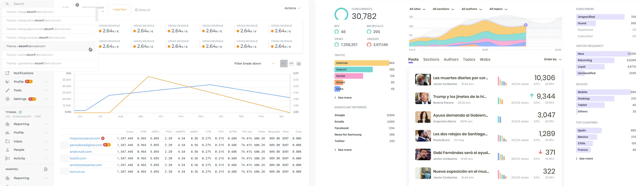
Marfeel Compass and Newsroom
Navigation Redesign
The work here wasn't building a new interface, it was absorbing Newsroom's capabilities into Compass without making the product feel bloated. Grouping related features into logical areas and making the sidebar collapsible gave the expanded feature set room to breathe without adding navigation layers that would have made the product feel heavier than it was.
- Grouped related features into logical areas.
- Collapsible sidebar to maximize canvas space when needed.
- Revamped iconography for clearer visual differentiation.
This reduced cognitive load and made navigation more scalable and predictable.
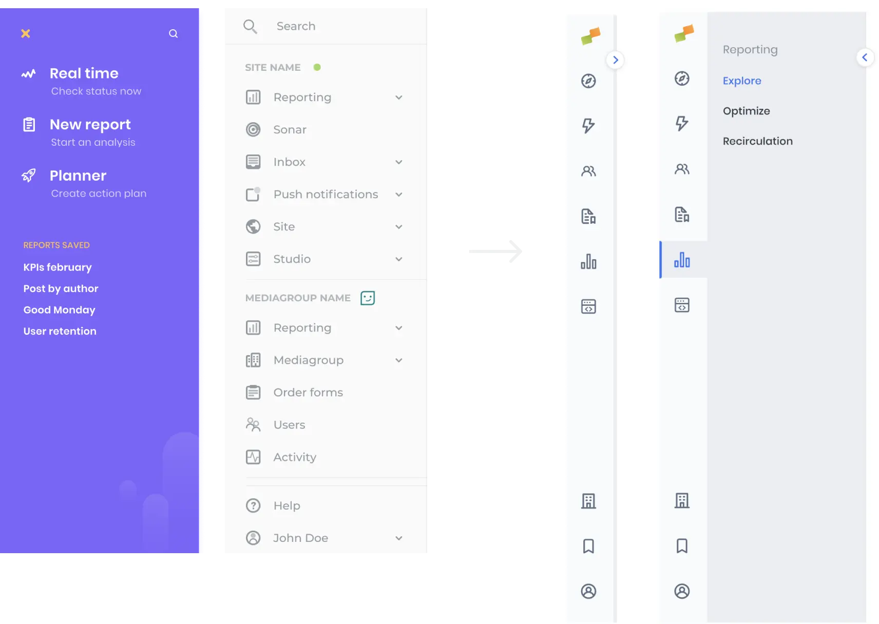
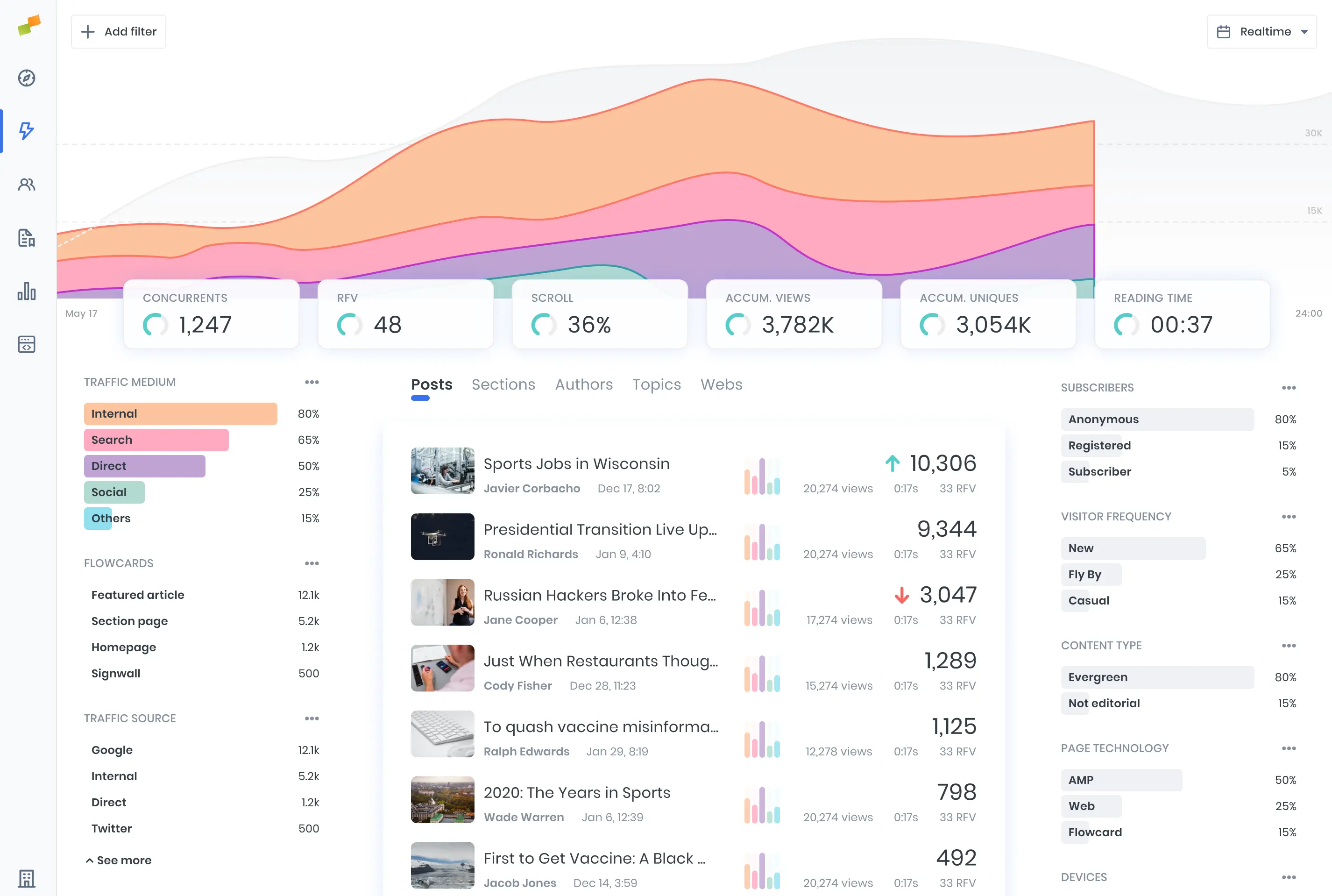
Main dashboard & KPI Visualization
I shaped the main dashboard around the metrics that mattered most in a concise, readable layout — using consistent color tokens to help users quickly identify key performance sources (e.g., traffic by medium across posts, sections, authors).
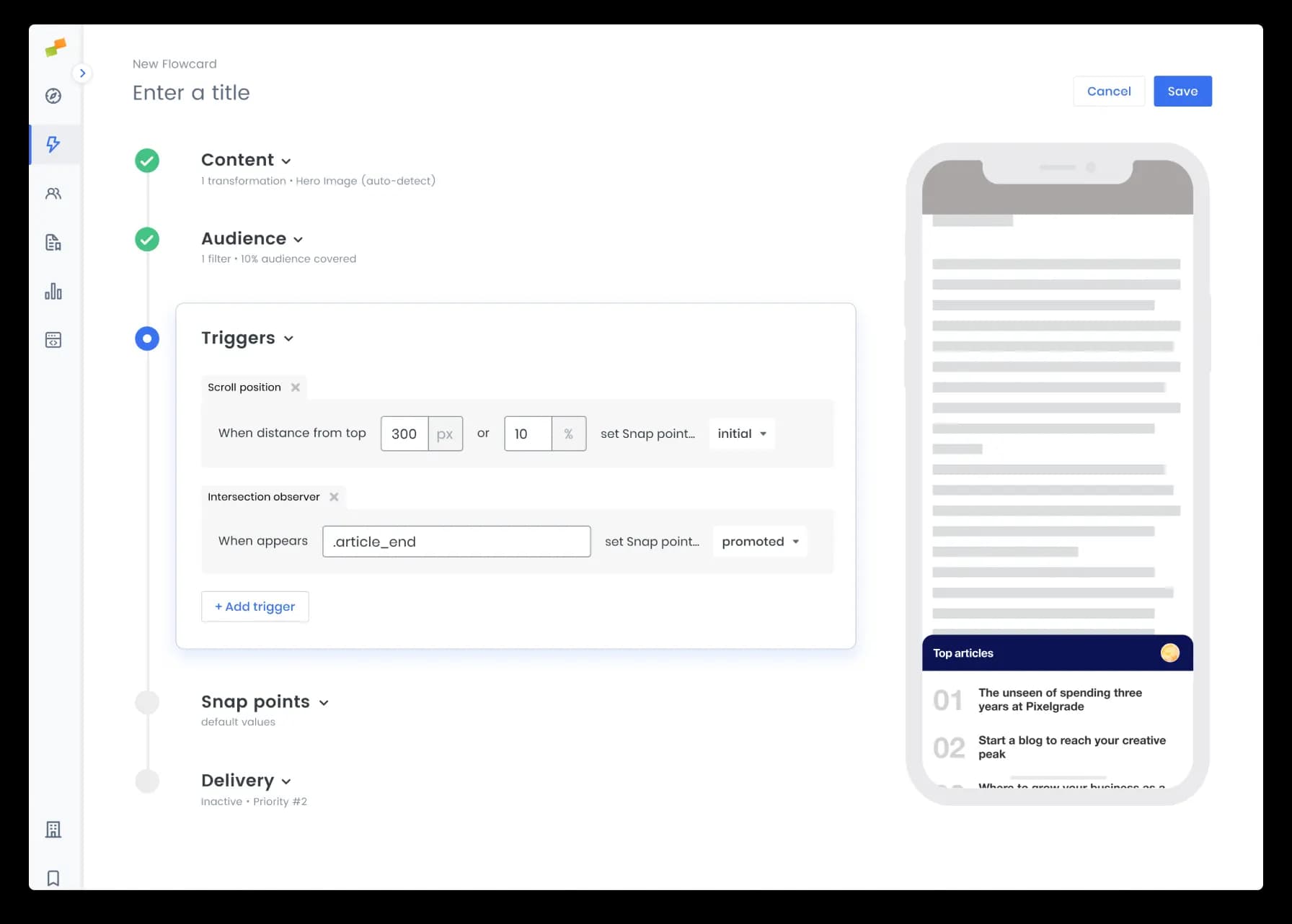
Flowcards Simplified
Flowcards promote content by using micro-segmentation capabilities and a no-code approach. Any editor can trigger a Flowcard to deliver specific content.
- Grouped configuration fields into collapsible steps.
- Created a clear sense of progress throughout the flow.
- Reduced visual complexity to minimize frustration.
The original flow presented all configuration options at once — a single long form with no sense of progress or priority. Editors were abandoning it mid-way. Grouping fields into sequential, collapsible steps gave the flow a clear beginning and end, and reduced the number of visible decisions at any one point without removing control.
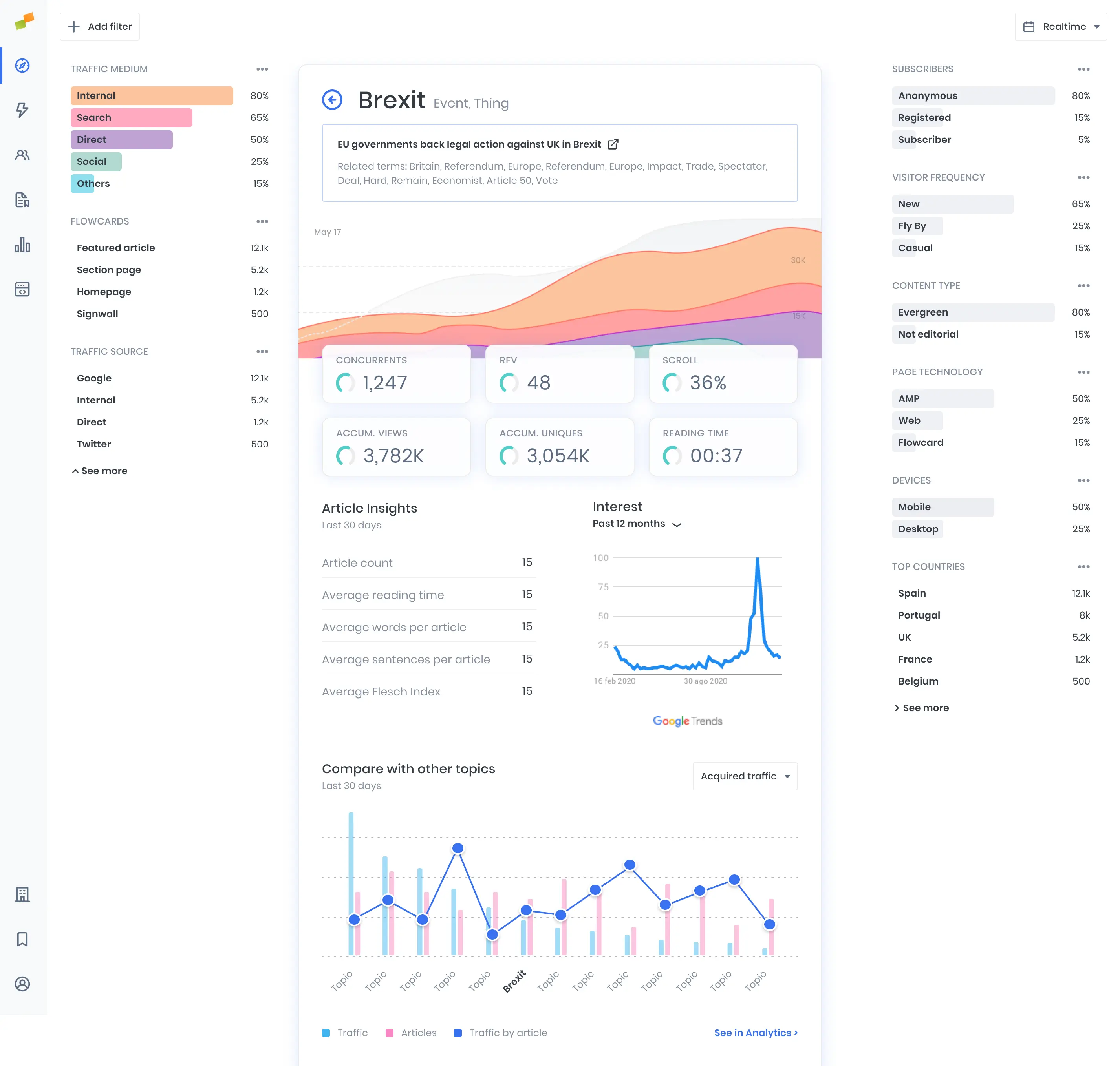
Detail page - Topic View
By applying a consistent visual hierarchy and design patterns throughout the product, we ensured that essential data across topics and dashboards was easier to scan and understand.
Design System Leadership
I built the design system end to end and owned the bridge between design and engineering throughout. The system served both the web product and the mobile surfaces from a shared token foundation.
- Design tokens and layout foundations.
- Defined prop naming conventions jointly with engineers so Figma variants mapped directly to code.
- Component library with usage guidelines in Storybook.
- Assets, typography, and interaction guidelines.
I defined the new design direction:
- Switched to a more legible typeface optimized for dense data layouts.
- Established cohesive UI patterns across both legacy products.
- Increased white space to reduce scanning fatigue in dashboard-heavy workflows.
- Introduced rounded shapes and a restrained pastel palette to soften information density without reducing data visibility.
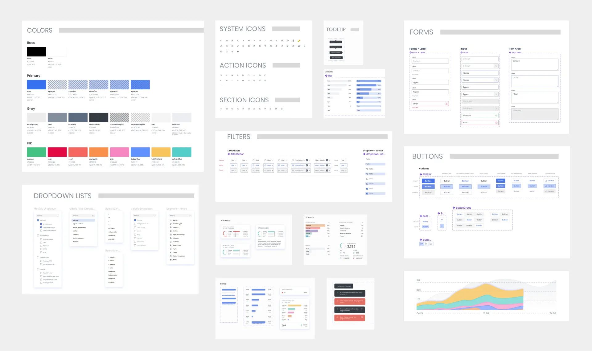
Foundation and Component samples from the Design System
Developer Handoff & Implementation
To keep design and engineering tightly aligned:
- Defined prop naming conventions in collaboration with engineering so that Figma variants had a direct, unambiguous mapping to implementation.
- Owned the Storybook (also using Chromatic for visual regression testing) setup end to end, wrote the stories, structured the component documentation.
This eliminated ambiguity in implementation and helped maintain fidelity across iterations.
Final Thoughts
Marfeel came in as two products that didn't fit together. The work wasn't just visual, it was structural. A unified IA, a design system used by both design and engineering, and a mobile templating layer that scaled across 100+ publishers without fracturing into exceptions.